BibleWords
CareerFoundry Project
BibleWords is a project I undertook to complete my certification at CareerFoundry. For individuals seeking a deeper understanding of the Bible, grasping the original meaning of its words is crucial. Many users found existing tools overwhelming and confusing. My challenge was to design a user-friendly resource that provided quick access to definitions and insights, simplifying the complexity while enriching personal devotion.
Role
Lead Product Designer
Responsibilities
UX/UI Design
Content Strategy
Prototyping
User Testing
Problem
Given the extensive meanings of these words, determining what users truly want to know and how to present this information in a way that simplifies and engages them poses a significant challenge. How can I effectively bridge this gap between between comprehensive infomration and a user-friendly experience?
As you can see, this information is usually quite overwhelming and cluttered.
User Surveys
To kick off my project, I determined that gathering user feedback was essential in identifying the types of content to feature in the vault. Relying on assumptions or personal preferences wouldn’t be sufficient; instead, I needed data-driven insights to inform my design choices and ensure the platform truly met users' needs.

Survey was done through a google form strategically submitted to churches and college students
After analyzing my survey findings, I identified the key elements users were seeking. As I suspected, many users expressed a dislike for much of the information commonly given. Now that I had data-backed direction on what users wanted to know, I could begin designing the card and definition page.
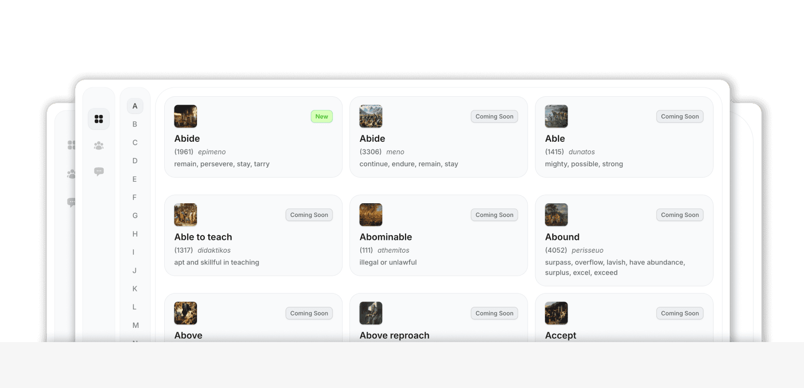
Simple Card Component
The card component posed a challenge because it needed to effectively introduce each word along with its definition, while not cluttering the page and also being visually appealing.
Design Decisions
Prominent English Word: The English word is highlighted in bold on a separate line to enhance visibility for users searching by English terms.
Simplified Design: To maintain a clean card layout, only the Greek word, its corresponding number, and the definition are displayed.
Visual Enhancement: An image of a historical painting related to the word adds color and enriches the contextual depth of the information.
Notification Badges: Badges in the top right indicate when a new word is posted, improving user awareness of updates.
I designed an information page that is both detailed and easy to navigate by choosing a clean, white layout. To make it simple for users to find what they need, each category is clearly divided by a faded line, enhancing clarity without compromising on simplicity.
Searching for Content
At this stage, I revisited the project goal: to design a user-friendly search option for quick access to word definitions and insights. In addressing the challenges I faced, I considered the following:
Content Organization
Given that the completed website would feature thousands of words, the card components needed to be organized into subcategories to minimize endless scrolling. I implemented an alphabetical sorting system to enhance navigation.
Sticky Navigation
Initially, the side navigation and search component disappeared as users scrolled through the content. As you can see below this made the site feel increasingly disjointed and broke up the 'flow' of it.
By 'sticking' both the navbar and search component it not only made the site retain easier access but allowed usrs to maintin their flow while exploring different section.
By 'sticking' both the navbar and search component, it not only made the site easier to access but also allowed users to maintain their flow while exploring different sections. Such a small change made a drastic change in the feel of the site.
Results
This project has been an invaluable learning experience that allowed me to explore the intricacies of user-centered design. By focusing on user feedback, I developed a platform that prioritizes clarity and accessibility, ensuring that individuals seeking to deepen their understanding of Biblical words can do so with ease.
This reinforced a fundamental design principle: always design based on data rather than assumptions. The necessity to simplify complex information compelled me to conduct thorough research to understand users' true desires. While this project is still in its beta phase, I believe the approach taken has the potential to resonate with users and effectively meet their needs.
Summary
Looking ahead, I am excited about the possibility of further refining and expanding this project into a fully functional resource. One key improvement I envision is creating a search filter that allows users to find specific words within particular Bible verses, enhancing the platform's search functionality. The insights gained throughout this process will undoubtedly inform my future design endeavors, and I look forward to applying these lessons to create meaningful, user-focused solutions.